
What is CKAN? For those who aren’t already familiar with the Comprehensive Knowledge Archive Network (CKAN), it is the leading tool for making open data websites. Think of it as a content management system like WordPress – but for data rather than for web pages and blog posts. It helps you manage and publish collections of data.
But what happens if you preview the raw data or download it, search through it, and view the complete dataset and you see and notice…. Well, nothing. That’s where data visualizations come in handy. They are fantastic tools coming in various forms, from simple charts and graphs to complex interactive dashboards that turn raw data into meaningful insights. Visualizations not only make data easier to understand but also help identify patterns, trends, and outliers that might not be apparent from looking at raw numbers alone. They’re invaluable for decision-making in fields like science and public policy and help communicate complex ideas in a clear, concise, and visually appealing manner.
So, in order to speed up the decision-making process, to identify the trends and patterns, to help with the forecasts or plannings or simply highlight inconsistencies or errors – CKAN goes with the flow and offers a variety of options for visualizing the data it manages, coming from the CKAN core or developed as CKAN extensions. The choice of visualization depends on the nature of the data and the message We want to convey, but here We’ll list the commonly used ones.
Core CKAN Visualizations
The Tables View
Let’s start the list with the visualization that comes with the core CKAN – The Tables view (plugin: datatables_view). This visualization displays a filterable, sortable, table view of structured data using the DataTables jQuery plugin, with the following features:
- Search highlighting
- Column Filters
- Multi-column sorting
- Two view modes (table/list). Table shows the data in a typical grid with horizontal scrolling. List displays the data in a responsive mode, with a Record Details view.
- Filtered Downloads
- Column Visibility control
- Copy to clipboard and Printing of filtered results and row selection/s
- Drag-and-drop column reordering
- State Saving – saves search keywords, column order/visibility, row selections and page settings between sessions, with the ability to share saved searches.
- Data Dictionary Integration
- Automatic “linkification” of URLs
- Automatic creation of zoomable thumbnails when a cell only contains a URL to an image.
- Available automatic, locale-aware date formatting to convert raw ISO-8601 timestamps to a user-friendly date format
It is designed not only as a data viewer, but also as a simple ad-hoc report generator – allowing users to quickly find an actionable subset of the data they need from inside the resource view, without having to first download the dataset.
It’s also optimized for embedding datasets and saved searches on external sites – with a backlink to the portal and automatic resizing.

Dataexplorer
Although it will be deprecated in the later CKAN versions the Dataexplorer (or the recline view plugin) is still a possibility in core CKAN and still is a popular choice (old habits die hard) . This one adds a rich widget, based on the Recline Javascript library. It allows querying, filtering, graphing and mapping data. It’s optimized for displaying structured data hosted on the DataStore extension.
The Data Explorer can also display certain formats of tabular data (CSV and Excel files) without its contents being uploaded to the DataStore. This is done via the DataProxy, an external service that will parse the contents of the file and return a response that the view widget understands. However, as the resource must be downloaded by the DataProxy service and parsed before it is viewed, this option is slower and less reliable than viewing data that is in the DataStore. It also does not properly support different encodings, proper field type detection, etc so users are strongly encouraged to host data on the DataStore instead.

The Dataexplorer allows you to create graphs from data stored on the DataStore. You can choose the graph type (such as lines, bars, columns, etc) and restrict the displayed data, by filtering by a certain field value or defining an offset and the number of rows.
It also shows data stored on the DataStore in an interactive map. It supports plotting markers from a pair of latitude / longitude fields or from a field containing a GeoJSON representation of the geometries. The configuration also allows cluster markers if there is a high density of them and to zoom automatically to the rendered features.
Customized Visualizations
Ckanext-visualize
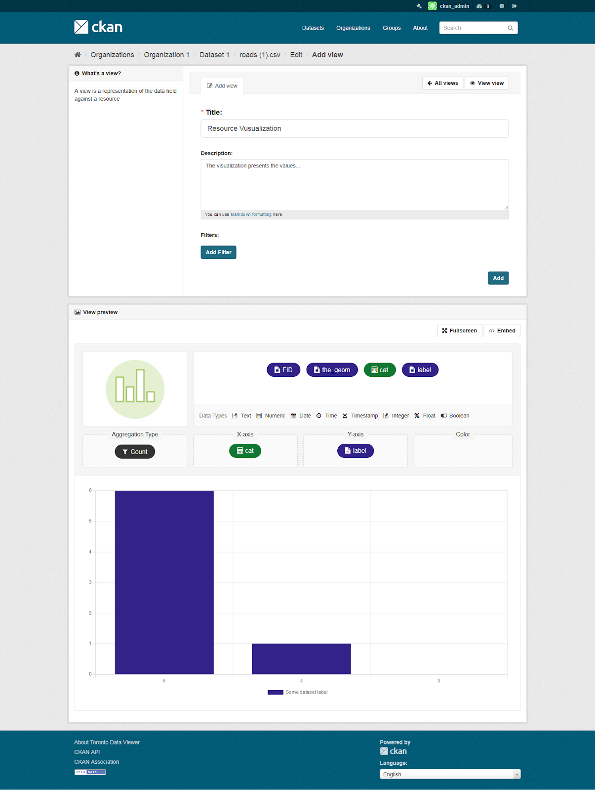
Let’s start the custom visualizations list with our very own, Keitaro’s ckanext-visualize. It’s a custom CKAN extension which allows users to visualize data in a very efficient and intuitive way, in a simple to use user interface. The viewer automatically creates the most meaningful chart based on the chosen columns. It’s intuitive, easy to use and enables users to easily build and visualize charts that are simple to use and understand. Some of the features are
- Predefined charts: Administrators can create meaningful charts for users as CKAN views, so they can immediately visualize and understand the data.
- Standalone chart viewer: The extension allows the chart viewer to be embedded on third-party websites without creating CKAN views.
- Intelligent chart type selection: Depending on the data types of the columns that are chosen, the extension automatically chooses the most appropriate type to visualize the data.
- Drag-and-drop columns: Creating a chart is as easy as dragging a column from the list of all available columns into the X or Y axis.
- Color attribute: Data in the chart can be grouped based on the selected column and colored for each distinct value.
- Visually distinct columns: All available columns that can be dragged are color coded based on the data type of the column and have a specific icon defined in a legend.
- Chart types: The viewer supports the following types of chart: bar, line and point, with more coming in the next release.
- Customizable color palette: The extension comes with a default color palette that is using carefully chosen colors that are accessible, with the possibility to change them and add additional ones from a configuration page.
- Customizable chart type icons: For each supported chart type, there is a corresponding icon that can be customized from a configuration page.
- Responsive: The extension is optimized to work across many screen sizes, from mobile to desktop.

Ckanext-geoview
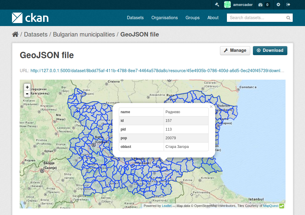
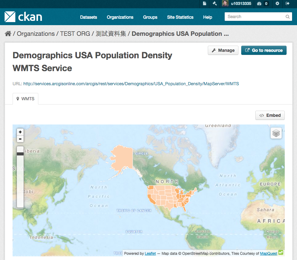
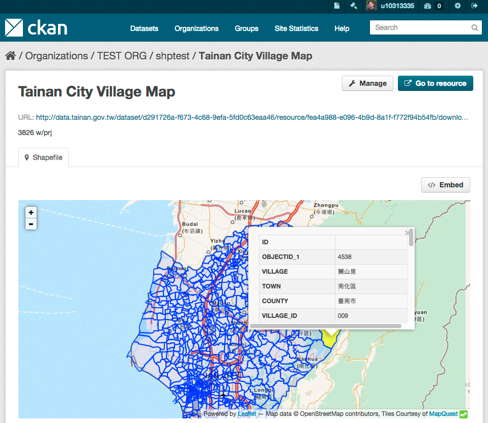
This extension enhances CKAN’s capabilities for managing and visualizing geospatial data. It contains view plugins to visualize geospatial files and services and contains features to display and interact with geographic data more effectively so users can visualize geographic datasets in various formats allowing for better understanding and analysis of the spatial data. It extends the CKAN capability to visualize geospatial data formats like GeoJSON, Shapefiles, KML, and GeoRSS. These the following plugins available within the ckanext-geoview:
OpenLayers Viewer provides access and enables the visualizations from the following geospatial formats and services: Web Map Service (WMS), Web Feature Service (WFS), GeoJSON, GML, KML, ArcGIS REST API, Google Fusion Tables

Leaflet GeoJSON Viewer will render GeoJSON files on a map and add a popup showing the features properties, for those resources that have a geojson format
Leaflet WMTS Viewer will render WMTS (Web Map Tile Service) layers on a map for those resources that have a wmts format.
Leaflet ESRI Shapefile Viewer will render ESRI Shapfiles (A ZIP archive contains the .shp, .shx, .dbf, and .prj files) on a map and add a popup showing the features properties, for those resources that have a shp format.
CKAN and visualization platforms
If the visualizations listed above are just not what you are looking for or lack the options you need, then maybe integrating CKAN with some visualization platform (like Apache Superset) can be the answer. For example, Using CKAN and Apache Superset together can create a powerful, integrated system for data management, publication, and visualization. Integrating CKAN and Apache Superset will allow organizations to manage, publish, and visualize their data seamlessly by setting up a robust data platform that leverages the strengths of both CKAN and Superset where CKAN is focused on data management and publication and Apache Superset is centered around data visualization and exploration, providing a comprehensive solution for data-driven decision-making. But this is a topic that deserves a comprehensive discussion on it’s own
Conclusion
In conclusion, CKAN’s visualization capabilities are a powerful asset for making open data more accessible, understandable, and actionable. They support a wide range of users in transforming raw data into meaningful insights, thereby enhancing the value and impact of open data initiatives. Choosing the right visualization for your data in CKAN depends on different factors like the type of data you have, the insights you want to convey, and the preferences of our audience and we hope this list makes the choice a bit easier to make.


